80 / 20 Architects
Services
Brand Identity · Custom Typography · Art Direction · Visual System
80-20 is an architectural practice focused on creating spaces through precision, balance, and thoughtful design. The visual identity was developed to reflect the relationship between architectural thinking, construction processes, and the materials that shape the built environment.
Concept
The identity explores the idea of structure and adaptability, creating a system that can transform across different applications while maintaining a strong and recognisable character.
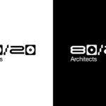
The logo was designed to operate through multiple interpretations in both horizontal and vertical compositions, allowing flexibility without losing its original form and visual consistency.
Custom Typography
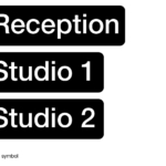
A custom typographic system was developed exclusively for 80-20, incorporating elements inspired by the everyday tools and materials used by architects and craftsmen.
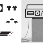
Screws, construction details, and objects from the architectural process were transformed into graphic elements, creating a visual language that connects the identity directly with the practice behind the work.
Visual System
The combination of custom typography, modular compositions, and material references creates a distinctive identity that reflects precision, craftsmanship, and architectural thinking.
The result is a flexible and memorable brand system that translates the physical world of architecture into a contemporary visual experience.